Configuration
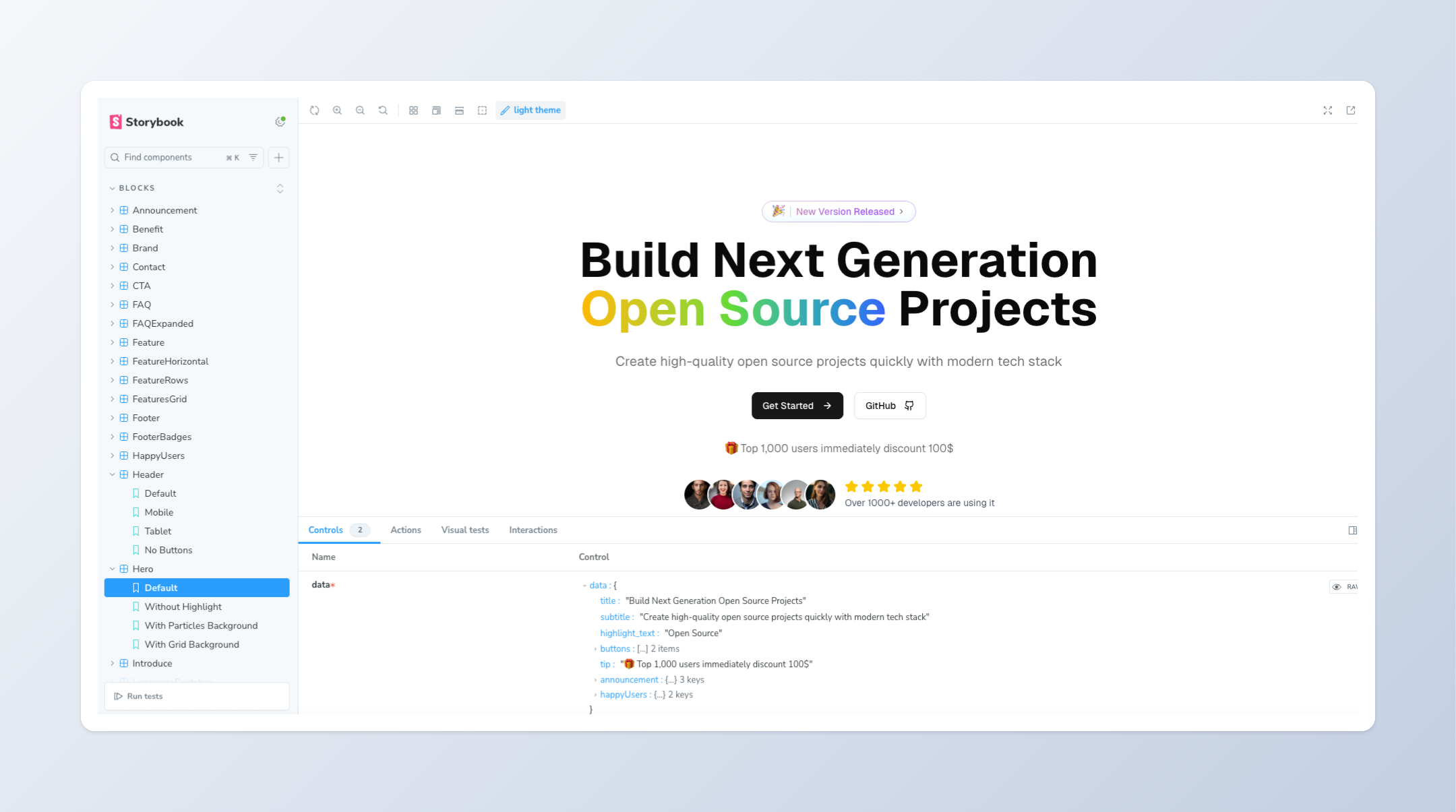
By default, Storybook is configured with our blocks and every component from shadcn/ui, and allows you to interact with them. It is also configured with the relevant fonts and higher-order components to ensure a consistent experience between your application and Storybook.Development
To start the app, run the following command in the root directory:Terminal
Adding stories
You can add your own components to the workshop by adding them to theapps/storybook/stories directory. Each component should have its own .stories.tsx file.